

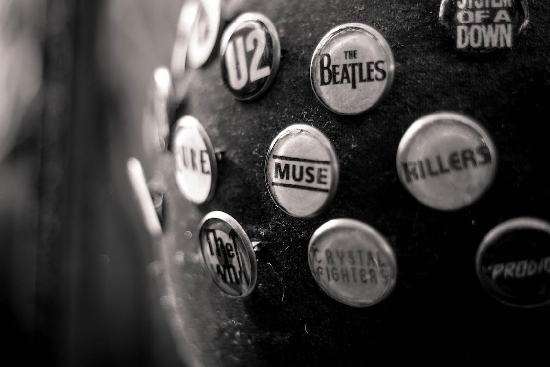
Graphic designers often talk about how colors can have an emotional impact. But did you know everything you view can have an emotional response too? That includes something as simple as fonts. Fonts have the power to communicate a great deal through their placement.
But what is font psychology, and why is it so important? Let’s have a look!
Font Psychology – Creating Emotions With Fonts
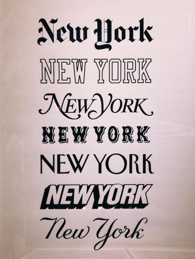
Did you know that 93% of personal connection isn’t verbal? That means ideas and visuals are the simplest and most effective ways to get the point across. If you look at the Kolenda Font Model, you’ll know that when an individual sees a font, they’ll likely associate it with a feeling or a trait. However, it’s not just about picking the font we like best. Consider how a graphic designer works; they focus on the typography, shape, and color of the font.
Typography
Typography involves structuring the font in a way that it’s visually appealing. This will have an impact on how an individual perceives a brand.
Shapes & Color of Font
With fonts, it’s important to remember both shape and color psychology. In shape psychology, we look at how a geometric shape will induce an emotion. For example, round fonts will have a relaxing vibe. While in color psychology, different hues will impact the viewer’s mood.
Why Brands Should Focus On Font Psychology
Fonts affect emotion just as colors do, and it’s been proven through research. This is the main reason brands should focus on fonts because behind font psychology lies the power to drive decisions and goals. Understanding how people will react to your fonts will give you a certain degree of control over how they react. It will empower your message and enable you to achieve your goals. Don’t know which font to use, check out the font styles and what they mean, or just hire professional design services that understand font psychology to take care of it instead.
Font Styles – What They Mean
There are a total of six font types, and each of them communicates differently.
- Serif Fonts
The Serif font type is the most traditional and the most legible font style out there. It has a classic and stable look, making it perfect for brands that want to look trustworthy and respectable. It’s common to see law firms, insurance companies, medical practices, etc., use a serif font. These businesses use serif font more because it conveys knowledge and feels authoritative. The most popular serif fonts include Times New Roman, Georgia, Didot, and Garamond.
- Slab Serif Fonts
Slab serif fonts are basically the younger brother of serif fonts – just with the confidence of youth. They look quite similar, and many won’t be able to tell the difference unless they look for it. A slab serif font is chunkier than a serif font because it squares off. They give off the same feeling but are bolder and more confident. A slab serif font is an excellent choice if you want your brand to pack a punch for a lasting impact. They perfectly display the energy of innovative products. They include fonts like Rockwell, Museo, and Courier.
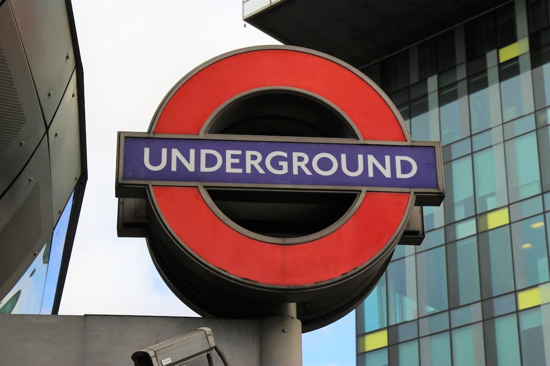
- Sans Serif Fonts
Sans serif takes a more simple approach without compromising its effectiveness. It’s clean and modern while managing to stay engaging. The minimal and straightforward embodies a no-nonsense attitude and is perfect for brands who want to look progressive and elegant. Since sans serif fonts make a clean break from tradition, they have an association with modernity. In addition, even though they look clean and simple, they are often used to showcase adventure. This font has become increasingly popular for label designs, logos, etc. The Google logo was changed from serif to sans serif font in 2015. It includes the classics like Century Gothic, Helvetica, and Arial.
- Script Fonts
Script fonts are rich in history and inspire emotion and creative ideas, making them perfect for visual brands. They have an artful nature that displays femininity and elegance with a handwritten style. Try a script font if you want your brand to come off as fun and romantic. However, you must proceed with caution when using script fonts because too much use will make your text illegible. The most famous script fonts include Lucida Script, Northwell, and Zapfino.
- Modern Fonts
Modern fonts or a unique take on past fonts with a futuristic look. A modern font will do if a brand wants to come off as practical and playful. The legibility of this font transitions between thick and thin strokes to create a sense of intellect. Modern fonts will showcase your brand the best if you’re trying to announce your brand and capture the interest of demographics like Gen Z or millennials.
- Display Fonts
You might have often seen large mediums like billboards, book covers, posters, etc., with unique and decorative fonts. This type of font is called a display font and can use serif, slab serif, or sans serif font. These fonts usually have a pictorial element and are eye-catching. The style used for display font largely affects what the audience associates with it. Usually, they evoke a more casual and fun feel. It is also adaptable to the brand’s personality and can be ideal for any kind of business.
Invest in Design
Finding the right design company is crucial to designing a good website, logo, brochure, etc. If you’re looking for professional design services in Miami, The Netmen Corp. is the way to go. They have experienced graphic designers who listen to your ideas and offer 100% personalized design services.
In addition to label design, they offer NFT illustrations, brochure designs, packaging designs, and more. If you’re looking for graphic designers or label design in Miami, contact them for more information on their services!